
The palette, the pairings, and the pieces that always work among the golden leaves.
Every year, fall rolls around and it's time to start thinking about outfits again — and let's be honest, planning what your whole family will wear can take real time (and sometimes money). But it doesn't always have to. Often, just opening your own closet with a clear color palette in mind is enough to pull together a look that feels put-together and cohesive, no shopping trip required.
The moment a client books a fall session with me, the first question is almost always the same: "What should we wear?" This guide is my answer — the color palette I recommend every time, and the few things I always tell clients to avoid.
Start with one statement piece. Choose your anchor outfit first — one elegant, timeless piece — and build the rest of the palette around it. Often, that's Mom's outfit, but it doesn't have to be. There's no such thing as "too dressed up" for a family session.
Coordinate, Don't Match
Aim for a cohesive palette by mixing neutral, earthy tones with an accent color. Cream, sage, medium blue, dusty pink, and terracotta blend well together. To keep the image from looking flat, limit each color to no more than two people in the group.
Embrace Layers & Textures
Layers add depth: cardigans, sweaters, vests. Prioritize natural materials like cotton, linen, cashmere, or merino wool for a warm, textured look. Accessories help, but keep it light — dainty jewelry, a watch, or a belt is enough for a polished finish.
Avoid Busy Patterns & Logos
Use patterns sparingly — ideally on just one person in the group, and only if it complements the overall palette. Large or busy prints pull the eye away; a subtle pattern, on the other hand, adds visual interest without stealing the spotlight, especially in close-up shots.
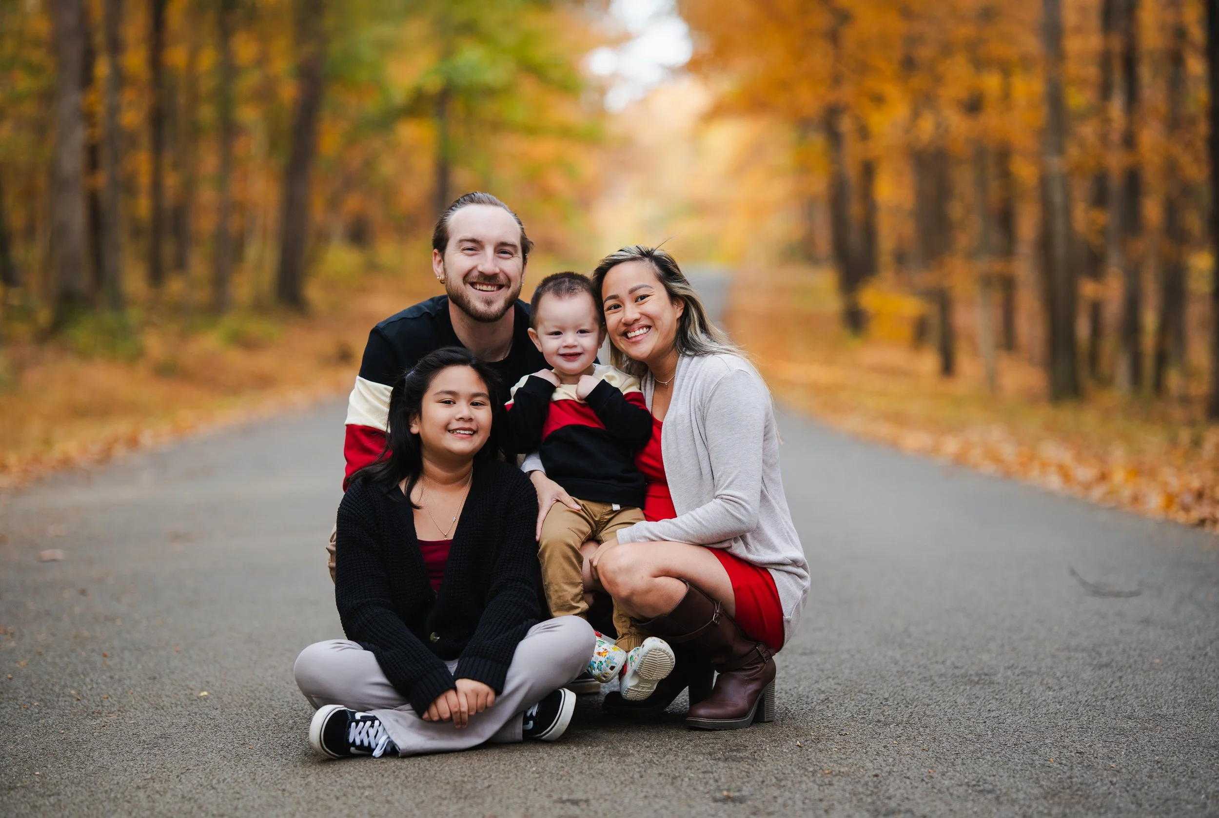
Repeat an Accent Color
Black and gray create a neutral base, while touches of burgundy bring the outfits together. You don't need everyone wearing the same colors; repeating one accent color in a few pieces is enough to make the whole family look coordinated while still letting everyone feel like themselves.
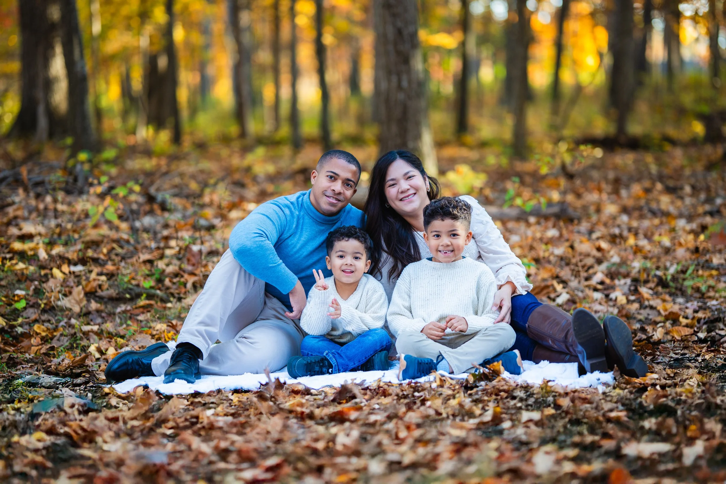
Denim + One Accent Color
Start with soft neutrals like cream, white, and beige, then add one accent color to bring the look together. Here, shades of blue add just enough contrast while keeping the overall look simple, relaxed, and coordinated.
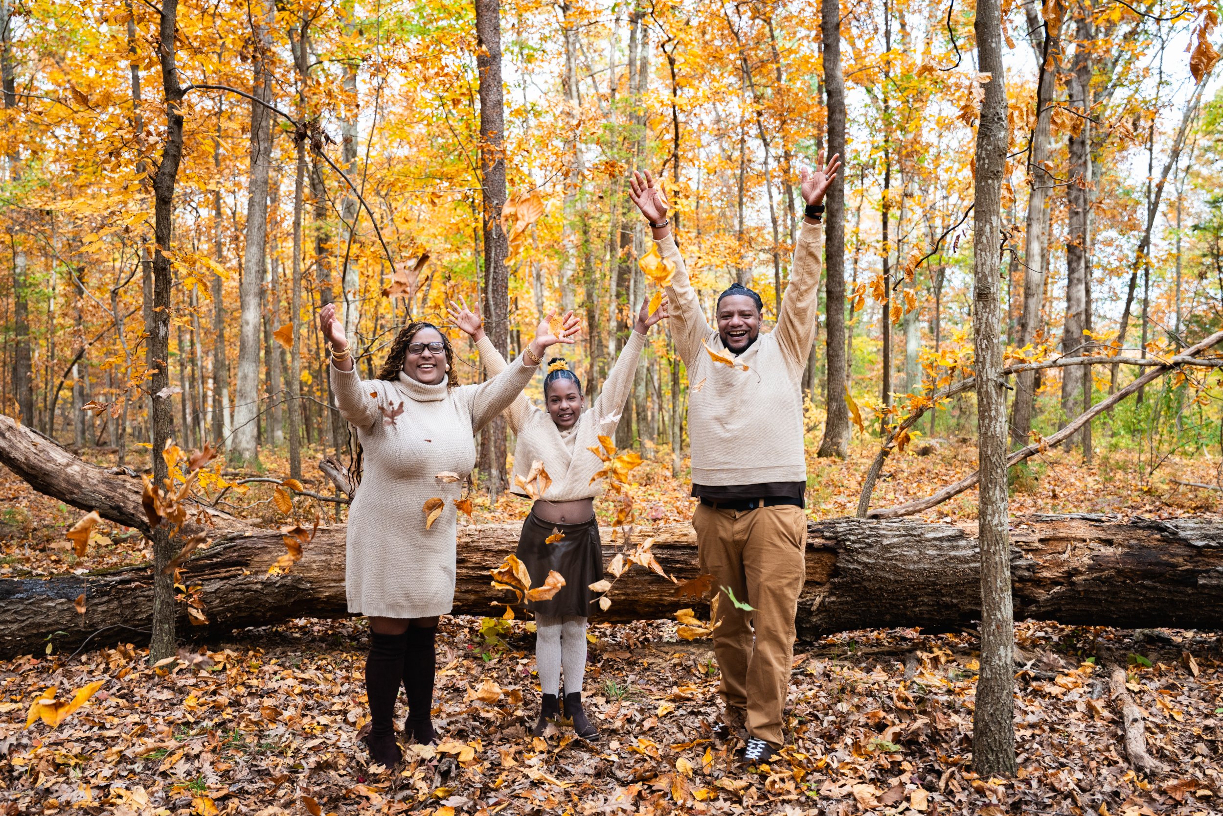
Warm Neutrals + Earth Tones
Cream and beige create a soft neutral base, while camel and brown add warmth and dimension. Keeping everyone within the same earthy palette makes the outfits feel connected without having to match — and works beautifully with the natural colors of fall.
Bold Colors, Balanced Together
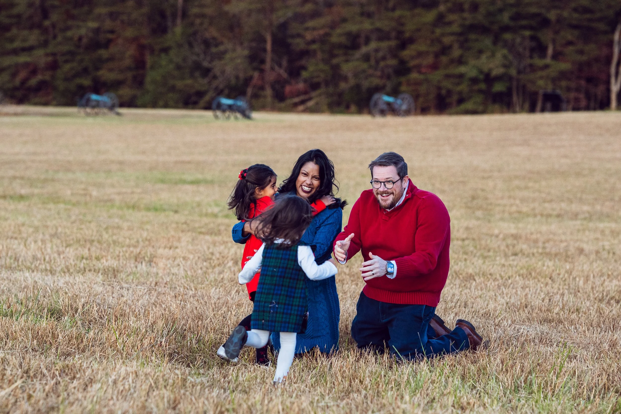
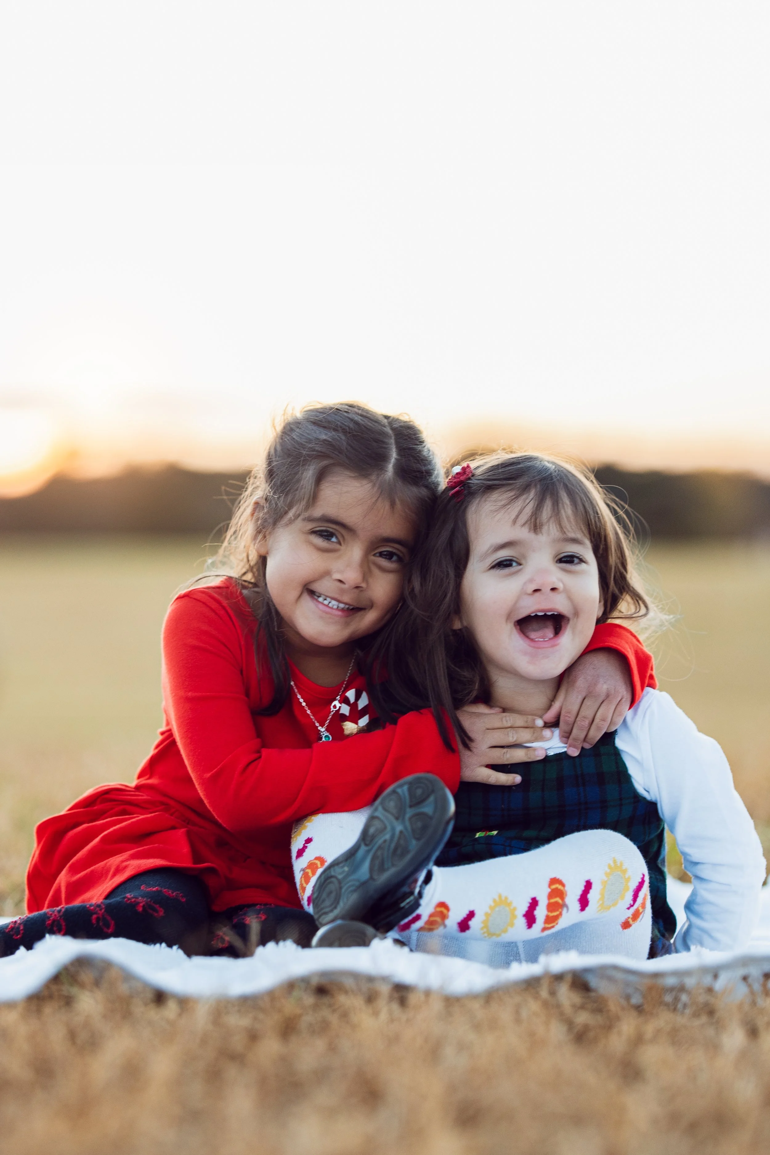
Bold colors can work beautifully for fall photos when they’re repeated throughout the family. Here, red and blue create a strong color palette, while the darker tones and small details help connect the outfits without making everyone look the same.
Y debajo de la foto de las niñas podríamos poner una frase cortita tipo:
Repeating the same colors in smaller details is an easy way to tie the whole look together.
5 Mistakes to Avoid
Pre-Session Checklist
Choose 2–3 base colors from the earth-tone palette (camel, beige, gray)
Add 1 accent color (wine, mustard, or olive green)
Favor cream and warm whites over bright, stark white
Use layers and textures for visual depth
Coordinate colors as a family, not identical outfits
Test your outfit in natural light before session day
Ready for Your Fall Session?
Fall sessions are one of my favorite ways to document families in Northern Virginia. If you're planning yours this season, I'd love to help you choose a location, timing, and wardrobe that feels like you.
View Fall Session Options →